Excited to be back behind my keyboard and ready to share our caffeinated journey, I took a moment to step back and rethink the focus of this, our corner of the internet. Indeed, coffee will remain at its center (CoffeeTime™ Reviews to follow shortly) but as we dive deeper into our Roaring ’20s, our personal focus has shifted to travel — and so will Caffeinated In Los Angeles! To this end, our new categories are Coffee for caffeinated reviews, Life for our married outings in the city, and Travel for all our foreign (and domestic) adventures outside of Los Angeles.

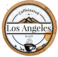
With this reorganization in mind, it was clear that it was time for our logo to evolve accordingly. After all, our logo has been the same since the last Website Updates entry which was (*checks notes*) almost four years ago! So I sat down with pen on one hand and sticky notes in the other and began to sketch. After a week or so of sketch after sketch, I arrived at a draft that I would then spend the next several days refining digitally as shown in the following progression.

It took countless iterations (and every ounce of my admittedly limited graphic design skills) to incorporate updated elements while still paying homage to the original design, but I am thrilled with the end results! The only point of disagreement with the final product was the coffee stain around the logo, but in the end we chose to keep it — for now.
Tell me, how often do you update your site? What inspired your logo? Perhaps the most important question, should the coffee stain stay or go?
Thank you so much for visiting our corner of the internet! If you enjoyed this post, please make sure to subscribe for more caffeinated content! Have an awesome day! ☕
(Featured Image by: Format)

I think your coffee stain should stay, unless you move away from the coffee part entirely. Looks more like a comfortable place to spend some time with that “used” look to it! Just my thoughts though. It is a great logo whichever way you choose for it. So, how big is your coffee cup? I just got a new one for Christmas, it holds 20 ounces, perfect for starting the day, not just one cup though! Have a great evening!😃😺☕☕
LikeLiked by 1 person
The logo is beautiful and perfectly represents your site and content, and I also think the coffee stain should stay! I have to update my website soon but it’s a lot of work and keep procrastinating it ahah
LikeLike